In mobile applications, you often want to show or hide widgets based on certain actions. Flutter offers many ways to show or hide widgets dynamically. In this post, we will go over those techniques, helping you understand how and when to use them.
Table of contents
Starting Project
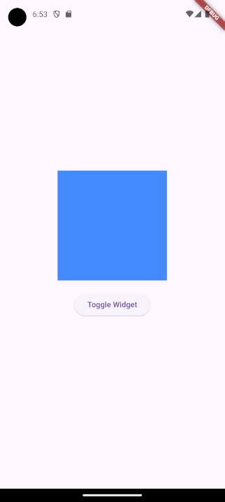
To get started, we have the following code inside our main.dart file.
import 'package:flutter/material.dart';
void main() => runApp(const MyApp());
class MyApp extends StatefulWidget {
const MyApp({super.key});
@override
State<MyApp> createState() => _MyAppState();
}
class _MyAppState extends State<MyApp> {
@override
Widget build(BuildContext context) {
return MaterialApp(
home: Scaffold(
body: Center(
child: Column(
mainAxisAlignment: MainAxisAlignment.center,
children: [
Container(color: Colors.blueAccent, height: 200, width: 200),
const SizedBox(height: 20),
ElevatedButton(
onPressed: () {},
child: const Text('Toggle Widget'),
),
],
),
),
),
);
}
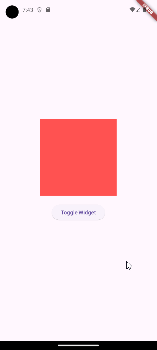
}In this code snippet, we created a simple Flutter application to display a blue Container widget. We also have an ElevatedButton which currently has no functionality. However, we want to use this button to toggle the visibility of the Container widget.
1. Conditional Rendering to Show or Hide Widgets
The first approach we will take to show or hide widgets in Flutter is called conditional rendering. In the code snippet below, we made changes to our starting code.
import 'package:flutter/material.dart';
void main() => runApp(const MyApp());
class MyApp extends StatefulWidget {
const MyApp({super.key});
@override
State<MyApp> createState() => _MyAppState();
}
class _MyAppState extends State<MyApp> {
bool isVisible = false;
@override
Widget build(BuildContext context) {
return MaterialApp(
home: Scaffold(
body: Center(
child: Column(
mainAxisAlignment: MainAxisAlignment.center,
children: [
if (isVisible) Container(color: Colors.blueAccent, height: 200, width: 200),
const SizedBox(height: 20),
ElevatedButton(
onPressed: () => setState(() => isVisible = !isVisible),
child: const Text('Toggle Widget'),
),
],
),
),
),
);
}
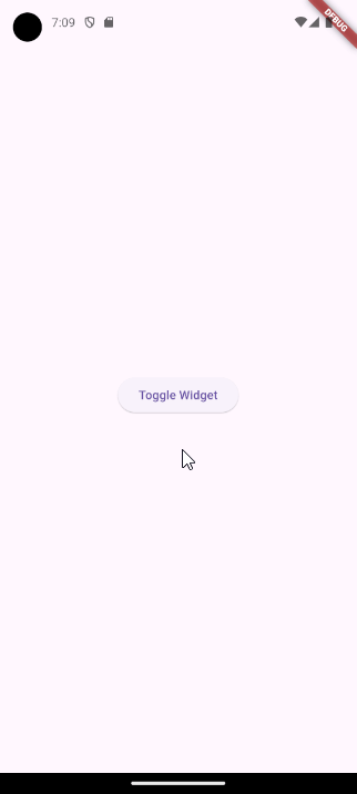
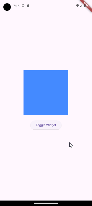
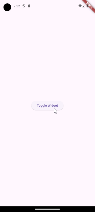
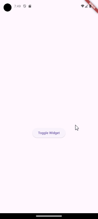
}In the above code, we introduced conditional rendering with an if statement. We use a boolean variable called isVisible to determine whether the Container widget should be shown or hidden. When isVisible is true, the blue Container widget is displayed, otherwise, it is hidden.
When the ElevatedButton is pressed, we use the setState function to set the isVisible variable to the opposite boolean value. Whenever, setState is called the widget tree rebuilds and therefore our blue Container will either be shown or hidden.
Using curly brackets with an
ifstatement inside thebuildmethod to wrap widgets is not allowed because it returnsSet<type>, which is not compatible with the expectedWidgetreturn type. Luckily in Flutter we can omit the curly brackets.
Replacement Widget
In the previous implementation, we completely hid our widget. With conditional rendering, it is also possible to show a replacement widget when the original is hidden. See the code below for an example.
import 'package:flutter/material.dart';

void main() => runApp(const MyApp());

class MyApp extends StatefulWidget {
  const MyApp({super.key});

  @override
  State<MyApp> createState() => _MyAppState();
}

class _MyAppState extends State<MyApp> {
  bool isVisible = false;

  @override
  Widget build(BuildContext context) {
    return MaterialApp(
      home: Scaffold(
        body: Center(
          child: Column(
            mainAxisAlignment: MainAxisAlignment.center,
            children: [
              isVisible
                  ? Container(color: Colors.blueAccent, height: 200, width: 200)
                  : Container(color: Colors.redAccent, height: 200, width: 200),
              const SizedBox(height: 20),
              ElevatedButton(
                onPressed: () => setState(() => isVisible = !isVisible),
                child: const Text('Toggle Widget'),
              ),
            ],
          ),
        ),
      ),
    );
  }
}
In this code snippet, we replaced the if statement with the ternary operator (? :) to show the blue Container widget when isVisible is true and the red Container widget when isVisible is set to false, see the GIF below.
Instead of using the ternary operator, we can also use a regular if-else statement without the brackets.
if (isVisible)
  Container(color: Colors.blueAccent, height: 200, width: 200)
else
  Container(color: Colors.redAccent, height: 200, width: 200)
One is not better than the other. However, some people find regular
if-elsestatements easier to read.
2. Use the Visibility Widget to Show or Hide Widgets
In Flutter, there is also a dedicated widget for hiding other widgets called the Visibility widget. This widget has a required property called visible, which takes a boolean value. When visible is true, the child widget remains visible, whereas setting it to false hides the child widget. Let us go over some possible implementations.
Completely Hidden
To completely hide a widget we can wrap our Container widget with the Visibility widget.
import 'package:flutter/material.dart';

void main() => runApp(const MyApp());

class MyApp extends StatefulWidget {
  const MyApp({super.key});

  @override
  State<MyApp> createState() => _MyAppState();
}

class _MyAppState extends State<MyApp> {
  bool isVisible = false;

  @override
  Widget build(BuildContext context) {
    return MaterialApp(
      home: Scaffold(
        body: Center(
          child: Column(
            mainAxisAlignment: MainAxisAlignment.center,
            children: [
              Visibility(
                visible: isVisible,
                child: Container(
                  color: Colors.blueAccent,
                  height: 200,
                  width: 200,
                ),
              ),
              const SizedBox(height: 20),
              ElevatedButton(
                onPressed: () => setState(() => isVisible = !isVisible),
                child: const Text('Toggle Widget'),
              ),
            ],
          ),
        ),
      ),
    );
  }
}
In this code snippet, we have introduced the Visibility widget with our Container widget as its child. We have set the visible property to our isVisible variable. The rest of the functionality remains unchanged, so when we press the button, the outcome will be as follows.
Replacement Widget
With the Visibility widget we can also render a replacement widget, see the following code.
import 'package:flutter/material.dart';

void main() => runApp(const MyApp());

class MyApp extends StatefulWidget {
  const MyApp({super.key});

  @override
  State<MyApp> createState() => _MyAppState();
}

class _MyAppState extends State<MyApp> {
  bool isVisible = false;

  @override
  Widget build(BuildContext context) {
    return MaterialApp(
      home: Scaffold(
        body: Center(
          child: Column(
            mainAxisAlignment: MainAxisAlignment.center,
            children: [
              Visibility(
                visible: isVisible,
                replacement: Container(
                  color: Colors.redAccent,
                  height: 200,
                  width: 200,
                ),
                child: Container(
                  color: Colors.blueAccent,
                  height: 200,
                  width: 200,
                ),
              ),
              const SizedBox(height: 20),
              ElevatedButton(
                onPressed: () => setState(() => isVisible = !isVisible),
                child: const Text('Toggle Widget'),
              ),
            ],
          ),
        ),
      ),
    );
  }
}
In the above code, we have added the replacement property to our Visibility widget. This property allows us to specify a replacement widget to display when the main widget is hidden. In our example, we used a red Container widget as the replacement.
Using the
replacementproperty with theVisibilitywidget achieves similar functionality as the conditional rendering approach but offers more flexibility. However, it is important to note that conditional rendering completely removes unnecessary widgets from the tree, while theVisibilitywidget retains the original widget in the tree but hidden.
Prevent Widget Movement
Previously, when we completely hid the blue Container widget, the button would move up because the container’s space was removed. To prevent this behavior, we can use additional properties offered by the Visibility widget.
import 'package:flutter/material.dart';

void main() => runApp(const MyApp());

class MyApp extends StatefulWidget {
  const MyApp({super.key});

  @override
  State<MyApp> createState() => _MyAppState();
}

class _MyAppState extends State<MyApp> {
  bool isVisible = false;

  @override
  Widget build(BuildContext context) {
    return MaterialApp(
      home: Scaffold(
        body: Center(
          child: Column(
            mainAxisAlignment: MainAxisAlignment.center,
            children: [
              Visibility(
                visible: isVisible,
                maintainSize: true,
                maintainAnimation: true,
                maintainState : true,
                child: Container(
                  color: Colors.blueAccent,
                  height: 200,
                  width: 200,
                ),
              ),
              const SizedBox(height: 20),
              ElevatedButton(
                onPressed: () => setState(() => isVisible = !isVisible),
                child: const Text('Toggle Widget'),
              ),
            ],
          ),
        ),
      ),
    );
  }
}
In this code snippet, we have introduced three properties: maintainSize, maintainAnimation, and maintainState, all set to true. The maintainSize property ensures that the Container widget remains hidden while still occupying its space. The maintainSize property can only be set to true whenever the maintainAnimation and maintainState are also set to true.
We also removed the replacement property, because it cannot be used in combination with the maintainState property.
3. Changing the Color to Transparent to Show or Hide Widgets
Another way to hide our widget is by setting its color property to Colors.transparent. Although this approach may not be used for every widget, it can still be a convenient tool to use in certain scenarios.
import 'package:flutter/material.dart';

void main() => runApp(const MyApp());

class MyApp extends StatefulWidget {
  const MyApp({super.key});

  @override
  State<MyApp> createState() => _MyAppState();
}

class _MyAppState extends State<MyApp> {
  bool isVisible = false;

  @override
  Widget build(BuildContext context) {
    return MaterialApp(
      home: Scaffold(
        body: Center(
          child: Column(
            mainAxisAlignment: MainAxisAlignment.center,
            children: [
              Container(
                color: isVisible ? Colors.blueAccent : Colors.transparent,
                height: 200,
                width: 200,
              ),
              const SizedBox(height: 20),
              ElevatedButton(
                onPressed: () => setState(() => isVisible = !isVisible),
                child: const Text('Toggle Widget'),
              ),
            ],
          ),
        ),
      ),
    );
  }
}
In this code snippet, we use the isVisible variable to determine the value of the color property. When isVisible is false, we set the color to Colors.transparent, otherwise, it is set to Colors.blueAccent.
As you can see in the GIF below this approach also prevents the widgets from moving. This is because the widget is still rendered, even though it is not visible.

Conclusion
Flutters offers many techniques to dynamically show or hide widgets that allow you to create interactive and flexible user interfaces. No matter which technique you pick: conditional rendering, the Visibility widget, or color changes. Each approach has its advantages and can be used depending on specific use cases and requirements.