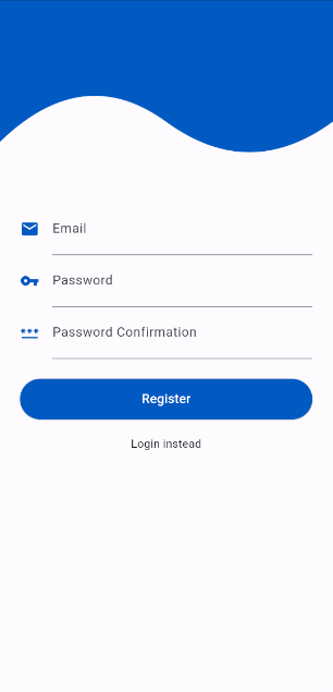
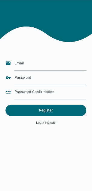
Most mobile applications allow the user to create an account and log in. In Flutter it is quite simple to create a login screen from scratch. In this post, we will create a login screen and go through each step together. The login screen we are building contains email and password fields, along with registration and login buttons. At the end of the post, you will understand the basics of creating a login screen and you will have a nice template you can use in all your applications.
Table of contents
Creating our Project
For this tutorial we start with a new Flutter project, however, it is possible to follow along with an existing project. You can create a new project by executing the following command where flutter_authentication is the name of the project:
flutter create flutter_authenticationOnce the project is created, open the project and replace the contents of the main.dart file with the following code:
import 'package:flutter/material.dart';
import 'package:flutter_authentication/authentication_screen.dart';

void main() => runApp(const MyApp());

class MyApp extends StatelessWidget {
  const MyApp({super.key});

  @override
  Widget build(BuildContext context) {
    return MaterialApp(
      theme: ThemeData(
        colorScheme: ColorScheme.fromSeed(seedColor: Colors.blueAccent),
        useMaterial3: true,
      ),
      home: const AuthenticationScreen(),
    );
  }
}
In the above code, we created the MyApp widget. The MyApp widget will return our MaterialApp widget with our AuthenticationScreen set on the home property. We are also making use of Material3 because Material2 will eventually be deprecated.
Creating the Login Screen in Flutter
Once you changed the contents of the main.dart file we can continue creating our AuthenticationScreen widget. In Flutter it is always recommended to separate your widgets into different files. Therefore we start by creating a new file called authentication_screen.dart.
Inside this new file, we create our AuthenticationScreen widget which will be stateful.
import 'package:flutter/material.dart';

class AuthenticationScreen extends StatefulWidget {
  const AuthenticationScreen({super.key});

  @override
  State<AuthenticationScreen> createState() => _AuthenticationScreenState();
}

class _AuthenticationScreenState extends State<AuthenticationScreen> {
  @override
  Widget build(BuildContext context) {
    return Scaffold(
      body: Form(
        child: Column(
          children: [
            const SizedBox(height: 50),
            TextFormField(),
            TextFormField(),
            TextFormField(),
            ElevatedButton(
              onPressed: () {},
              child: const Text('Register'),
            ),
            InkWell(
              onTap: () {},
              child: const Text('Login instead'),
            )
          ],
        ),
      ),
    );
  }
}
The AuthenticationScreen widget returns a Scaffold. Inside the Scaffold we have a Form widget that will make it easier to handle the user input. To ensure that the Form widget can access the user input, we will insert all the input fields and buttons inside the Form widget. Because the Form widget only allows a child we add a Column widget so that we can add multiple widgets.
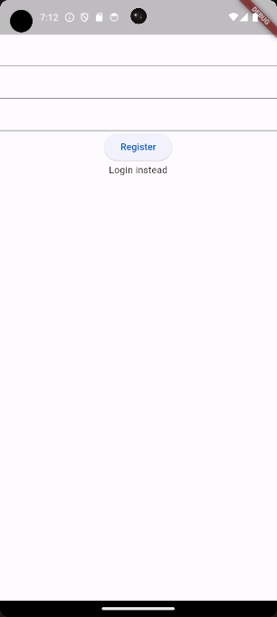
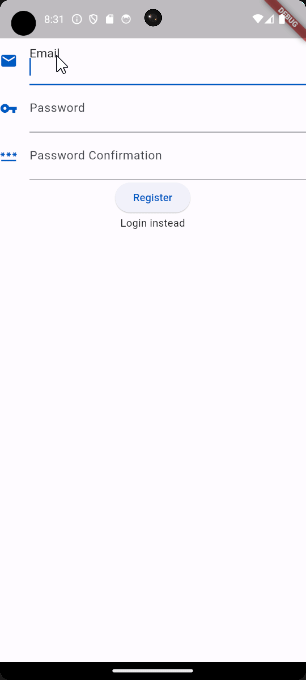
For now, we have added 3 TextFormFields widgets a button and an InkWell. If you are not familiar with the InkWell widget. An InkWell widget can be used as a wrapper to make underlying widgets tappable. Now if we build our application you will see the following screen:
Text Input Fields
As seen in the example in the beginning we will have 3 input fields, Email, Password, and Password Confirmation. In the upcoming steps, we will add the label, icon, and other properties to the TextFormField widgets to create those fields.
1. Creating the Email Text Input Field
We will start with one TextFormField and then extract it into a separate widget to reuse it for the other fields.
import 'package:flutter/material.dart';

class AuthenticationScreen extends StatefulWidget {
  const AuthenticationScreen({super.key});

  @override
  State<AuthenticationScreen> createState() => _AuthenticationScreenState();
}

class _AuthenticationScreenState extends State<AuthenticationScreen> {
  final emailController = TextEditingController();

  @override
  Widget build(BuildContext context) {
    return Scaffold(
      body: Column(
        children: [
          Form(
            child: Column(
              children: [
                const SizedBox(height: 50),
                TextFormField(
                  controller: emailController,
                  decoration: InputDecoration(
                    floatingLabelStyle: Theme.of(context).textTheme.titleLarge,
                    icon: Icon(
                      Icons.email,
                      color: Theme.of(context).primaryColor,
                    ),
                    labelText: 'Email',
                  ),
                ),
                TextFormField(),
                TextFormField(),
                ElevatedButton(
                  onPressed: () {},
                  child: const Text('Register'),
                ),
                InkWell(
                  onTap: () {},
                  child: const Text('Login instead'),
                )
              ],
            ),
          ),
        ],
      ),
    );
  }
}
In the above code, we started by adding the emailController variable. This variable holds an instance of TextEditingController, which is assigned to the controller property of the TextFormField widget. The controller is used to keep track of the user input.
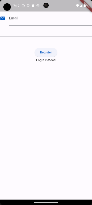
Furthermore, we added the decoration property that is used to style our TextFormField. We have increased the font size of the label by setting its style to Theme.of(context).textTheme.titleLarge. This is one of the global text themes that can be used to ensure that your text styles are consistent across your application. Other than that we added an email icon, and set the label text to “email”. These changes will result in the following:
2. Extracting our Custom Field Widget
Instead of repeating the above step for every TextFormField widget, let us move the widget to a new file called authentication_text_form_field.
import 'package:flutter/material.dart';

class AuthenticationTextFormField extends StatelessWidget {
  const AuthenticationTextFormField({
    required this.icon,
    required this.label,
    required this.textEditingController,
    super.key,
  });

  final IconData icon;
  final String label;
  final TextEditingController textEditingController;

  @override
  Widget build(BuildContext context) {
    final theme = Theme.of(context);

    return TextFormField(
      controller: textEditingController,
      obscureText: label.toLowerCase().contains('password'),
      decoration: InputDecoration(
        floatingLabelStyle: theme.textTheme.titleLarge,
        icon: Icon(icon, color: theme.colorScheme.primary),
        labelText: label,
      ),
    );
  }
}
In the new file, we will create a widget called AuthenticationTextFormField. This widget will take 3 parameters, icon, label, and textEditingController. In the build function of the new widget, we will return the textFormField widget we modified in the previous section with some additional changes.
Inside the function, we create a theme variable to avoid repeating ourselves. In the TextFormField we changed the controller property to always take the textEditingController parameter. We have added the obscureText property that will be used to hide the text in our password fields. As you can see the obscure text will only be set when the label contains “password”. At last, we assigned the icon, and label parameters to the icon and labelText properties.
3. Using our Custom Field widget
After extracting our TextFormField widget into a separate file. We can now use it to create the desired TextFormField widgets in the AuthenticationScreen:
import 'package:flutter/material.dart';
import 'package:flutter_authentication/authentication_text_form_field.dart';

class AuthenticationScreen extends StatefulWidget {
  const AuthenticationScreen({super.key});

  @override
  State<AuthenticationScreen> createState() => _AuthenticationScreenState();
}

class _AuthenticationScreenState extends State<AuthenticationScreen> {
  final emailController = TextEditingController();
  final passwordController = TextEditingController();
  final passwordConfirmationController = TextEditingController();

  @override
  Widget build(BuildContext context) {
    return Scaffold(
      body: Form(
        child: Column(
          children: [
            const SizedBox(height: 50),
            AuthenticationTextFormField(
              icon: Icons.email,
              label: 'Email',
              textEditingController: emailController,
            ),
            AuthenticationTextFormField(
              icon: Icons.vpn_key,
              label: 'Password',
              textEditingController: passwordController,
            ),
            AuthenticationTextFormField(
              icon: Icons.password,
              label: 'Password Confirmation',
              textEditingController: passwordConfirmationController,
            ),
            ElevatedButton(
              onPressed: () {},
              child: const Text('Register'),
            ),
            InkWell(
              onTap: () {},
              child: const Text('Login instead'),
            )
          ],
        ),
      ),
    );
  }
}
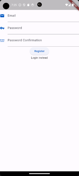
In the above code, we have created our 3 input fields by using our AuthenticationTextFormField widget. Always ensure that every TextFormField has its own controller. As you can see by creating our AuthenticationTextFormField the code becomes much easier to read and it is very easy to add new input fields.
Authentication Mode button
To allow the user to both register and log in we added an InkWell widget to switch between authentication modes. When registering, users must fill in the password confirmation field. However, during login, this field should remain hidden. So clicking the authentication mode button should toggle the visibility of the password confirmation field. In the code below we have done just that:
import 'package:flutter/material.dart';
import 'package:flutter_authentication/authentication_text_form_field.dart';

class AuthenticationScreen extends StatefulWidget {
  const AuthenticationScreen({super.key});

  @override
  State<AuthenticationScreen> createState() => _AuthenticationScreenState();
}

class _AuthenticationScreenState extends State<AuthenticationScreen> {
  final GlobalKey<FormState> _formKey = GlobalKey();
  final emailController = TextEditingController();
  final passwordController = TextEditingController();
  final passwordConfirmationController = TextEditingController();
  bool register = true;

  @override
  Widget build(BuildContext context) {
    return Scaffold(
      body: Form(
        key: _formKey,
        child: Column(
          children: [
            const SizedBox(height: 50),
            AuthenticationTextFormField(
              icon: Icons.email,
              label: 'Email',
              textEditingController: emailController,
            ),
            AuthenticationTextFormField(
              icon: Icons.vpn_key,
              label: 'Password',
              textEditingController: passwordController,
            ),
            if (register == true)
              AuthenticationTextFormField(
                icon: Icons.password,
                label: 'Password Confirmation',
                textEditingController: passwordConfirmationController,
              ),
            ElevatedButton(
              onPressed: () {},
              child: Text(register == true ? 'Register' : 'Login'),
            ),
            InkWell(
              onTap: () {
                setState(() => register = !register);
                _formKey.currentState?.reset();
              },
              child: Text(
                register == true ? 'Login instead' : 'Register instead',
              ),
            ),
          ],
        ),
      ),
    );
  }
}
In the above code snippet, we created a GlobalKey<FormState> named _formKey to handle the state of the form. We assigned the _formKey to the key property of the Form widget. We also added a boolean variable named register to determine the current screen mode. As you can see the register variable is used to conditionally render the Password Confirmation field and dynamically change the text of both the ElevatedButton and InkWell widgets.
At last, we updated the onTap property of the InkWell widget to toggle the register variable and reset the form using the _formKey.currentState?.reset function.
Styling the Flutter Login Screen
With the above steps completed, we finished the functionality part for the login screen. In the next part, we will continue styling the login screen.
1. Wave Decoration
In the example in the beginning, we have a wave shape on top of our login screen. To implement this we want to create a new file named wave.dart. Inside this file we will place the following code:
import 'package:flutter/material.dart';

class Wave extends StatelessWidget {
  const Wave({super.key});

  @override
  Widget build(BuildContext context) {
    return ClipPath(
      clipper: WaveClipper(),
      child: Container(color: Theme.of(context).primaryColor, height: 200),
    );
  }
}

class WaveClipper extends CustomClipper<Path> {
  @override
  getClip(Size size) {
    var path = Path();
    path.lineTo(0, 175);

    // The values of the calculations would be path.quadraticBezierTo(100, 75, 200, 150) if the height is 200 and the width is 400;
    path.quadraticBezierTo(size.width * 0.25, size.height * 0.50 - 25,
        size.width * 0.50, size.height * 0.75);

    // The values of the calculations would be path.quadraticBezierTo(300, 225, 400, 150) if the height is 200 and the width is 400;
    path.quadraticBezierTo(
        size.width * 0.75, size.height + 25, size.width, size.height * 0.75);

    path.lineTo(size.width, 0);
    path.close();

    return path;
  }

  @override
  bool shouldReclip(CustomClipper oldClipper) {
    return false;
  }
}
Normally I would go in-depth about how the code works, but to make this post not longer than it already is. I will leave this for another post in the future.
After having created the Wave widget. We can add it to our AuthententicationScreen widget.
import 'package:flutter/material.dart';
import 'package:flutter_authentication/authentication_text_form_field.dart';
import 'package:flutter_authentication/wave.dart';

class AuthenticationScreen extends StatefulWidget {
  const AuthenticationScreen({super.key});

  @override
  State<AuthenticationScreen> createState() => _AuthenticationScreenState();
}

class _AuthenticationScreenState extends State<AuthenticationScreen> {
  final GlobalKey<FormState> _formKey = GlobalKey();
  final emailController = TextEditingController();
  final passwordController = TextEditingController();
  final passwordConfirmationController = TextEditingController();
  bool register = true;

  @override
  Widget build(BuildContext context) {
    return Scaffold(
      body: Column(
        children: [
          const Wave(),
          Form( ... ),
        ],
      ),
    );
  }
}
After importing the Wave widget we can wrap our Form widget with a Column widget so that we can put our Wave on top of it. As you can see we will now have our wave on top.
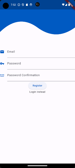
2. Applying padding to the Login Screen
To improve the look and spacing of our widgets, we can add some padding to give them some breathing space and make them visually appealing. Let us make the following changes:
import 'package:flutter/material.dart';
import 'package:flutter_authentication/authentication_text_form_field.dart';
import 'package:flutter_authentication/wave.dart';
class AuthenticationScreen extends StatefulWidget {
const AuthenticationScreen({super.key});
@override
State<AuthenticationScreen> createState() => _AuthenticationScreenState();
}
class _AuthenticationScreenState extends State<AuthenticationScreen> {
final GlobalKey<FormState> _formKey = GlobalKey();
final emailController = TextEditingController();
final passwordController = TextEditingController();
final passwordConfirmationController = TextEditingController();
bool register = true;
@override
Widget build(BuildContext context) {
return Scaffold(
body: Column(
children: [
const Wave(),
Form(
key: _formKey,
child: Padding(
padding: const EdgeInsets.symmetric(horizontal: 25),
child: Column(
children: [
const SizedBox(height: 50),
AuthenticationTextFormField(
icon: Icons.email,
label: 'Email',
textEditingController: emailController,
),
AuthenticationTextFormField(
icon: Icons.vpn_key,
label: 'Password',
textEditingController: passwordController,
),
if (register == true)
AuthenticationTextFormField(
icon: Icons.password,
label: 'Password Confirmation',
textEditingController: passwordConfirmationController,
),
const SizedBox(height: 25),
ElevatedButton(
onPressed: () {},
child: Text(register == true ? 'Register' : 'Login'),
),
const SizedBox(height: 20),
InkWell(
onTap: () {
setState(() => register = !register);
_formKey.currentState?.reset();
},
child: Text(
register == true ? 'Login instead' : 'Register instead',
),
),
],
),
),
),
],
),
);
}
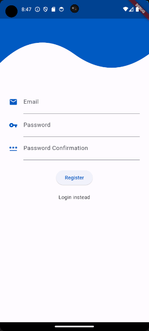
}In the above code snippet, we wrapped the second Column widget with a Padding widget to apply padding on the left and right of 25. We also added two additional SizedBox widgets to have padding around our buttons.
3. Login Button
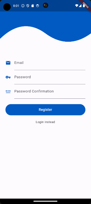
To make our login button match with the rest of the login screen we can add some additional styling, see the code below:
ElevatedButton(
  style: ElevatedButton.styleFrom(
    minimumSize: const Size.fromHeight(50),
    backgroundColor: Theme.of(context).colorScheme.primary,
  ),
  onPressed: () {},
  child: Text(
    register == true ? 'Register' : 'Login',
    style: Theme.of(context).textTheme.titleMedium?.copyWith(
          color: Colors.white,
        ),
  ),
),
The style property of the ElevatedButton can be used to customize the button. As you can see we assigned a new height and width to the button. We used Size.fromHeight(50) which will give the button an infinite width and a height of 50. We also changed the background color to our primary color and the text color to white.
4. Changing the Color of the Flutter Login Screen
At last, we can change the color of our AuthenticationScreen. Because we used Theme.of(context).colorScheme.primary to set the colors in our login screen, we only need to change the seedColor argument to change the colors:
import 'package:flutter/material.dart';
import 'package:flutter_authentication/authentication_screen.dart';

void main() => runApp(const MyApp());

class MyApp extends StatelessWidget {
  const MyApp({super.key});

  @override
  Widget build(BuildContext context) {
    return MaterialApp(
      theme: ThemeData(
        colorScheme: ColorScheme.fromSeed(seedColor: Colors.cyan),
        useMaterial3: true,
      ),
      home: const AuthenticationScreen(),
    );
  }
}
By changing the application’s theme you will see that our login screen will adapt to it:
Of course, if you want the login screen to use different colors you can change it by assigning regular colors to the color properties inside our login screen.
Adding Validation to the Login Screen
We have successfully created the login screen, but it does not validate the user input. If you want to validate the user input be sure to check out the following article: How to Validate Login Credentials in Flutter
Conclusion
In this post, we learned how to create a login screen in Flutter. We started by setting up a new Flutter project and creating the basic structure of the login screen. After that, we created the AuthenticationScreen widget and added the necessary UI components such as TextFormField widgets, an ElevatedButton, and an InkWell to switch between registration and login.
Not only that, we also extracted the TextFormField widget into a separate reusable widget. After that, we ensured that we could switch between authentication modes. Afterward, we added a wave shape at the top of the login screen and applied padding to the widgets to add proper spacing.
Lastly, we applied additional styling to the login button. Additionally, we adjusted the colors of the login screen to demonstrate how you can customize it to suit your preferences.