To get user data in Flutter, you can use the Form widget. While the Form widget is very flexible, it mainly supports text fields. Luckily, there is a package that provides many different types of fields, making it easy to build better forms in Flutter.
Table of contents
Create a Normal Form in Flutter
If you want to build a simple form in Flutter that only requires text fields, you can easily use Flutter’s Form widget along with the TextFormField widget. Here is a minimal example:
import 'package:flutter/material.dart';

void main() => runApp(const MyApp());

class MyApp extends StatelessWidget {
  const MyApp({super.key});

  @override
  Widget build(BuildContext context) {
    final GlobalKey<FormState> formKey = GlobalKey();
    final emailController = TextEditingController();
    final passwordController = TextEditingController();

    return MaterialApp(
      home: Scaffold(
        appBar: AppBar(),
        body: Padding(
          padding: const EdgeInsets.all(16.0),
          child: Form(
            key: formKey,
            child: Column(
              children: [
                TextFormField(
                  controller: emailController,
                  decoration: const InputDecoration(
                    label: Text('Email'),
                  ),
                ),
                TextFormField(
                  controller: passwordController,
                  decoration: const InputDecoration(
                    label: Text('Password'),
                  ),
                  obscureText: true,
                ),
                const SizedBox(height: 10),
                ElevatedButton(
                  onPressed: () => print([
                    emailController.text,
                    passwordController.text,
                  ]),
                  child: const Text('Submit'),
                )
              ],
            ),
          ),
        ),
      ),
    );
  }
}
In the above example, we have our MyApp widget that displays a Scaffold widget. Inside the Scaffold widget we return a Form widget. The Form widget has a child attribute that can be used to add form fields. Because we want to have multiple fields and a button, we use the Column widget. Because the Column widget allows us to add multiple widgets.
In the children attribute of the Column widget we display multiple TextFormField widgets. These are Flutter’s built-in form text field widgets. The TextFormField widget takes a controller attribute that is used to save the input data. At last, we have an ElevatedButton widget that will print the input data to the terminal.
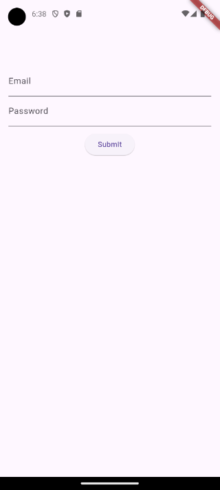
As you can see, the example above is a very minimal implementation. However, the Form widget is ideal for building forms with only text fields. If you want to learn more about it, feel free to check out the following article: How to Create a Login Screen in Flutter
Build Better Forms
As mentioned earlier, if we want to build a form with more than just text fields, we can use a package. The package we will be using is called Flutter Form Builder. It includes twelve different input fields and makes validating user input much simpler.
Installing Flutter Form Builder
To build better forms we need to install the following packages Flutter Form Builder and Form Builder Validators. The second package is only necessary for validation. We can install both packages by executing the following command inside our project:
flutter pub add flutter_form_builder form_builder_validatorsOnce the command is executed, make sure to check your pubspec.yaml file for the added dependencies. You should see the Flutter Form Builder and Form Builder Validators packages included in the dependencies section, like this:
dependencies:
  flutter_form_builder: ^9.3.0
  form_builder_validators: ^10.0.1
Create a Form in Flutter Using the Package
After installing the packages, we can start by creating a form using the FormBuilder class.
import 'package:flutter/material.dart';
import 'package:flutter_form_builder/flutter_form_builder.dart';

void main() => runApp(MyApp());

class MyApp extends StatelessWidget {
  MyApp({super.key});

  final GlobalKey<FormBuilderState> _formKey = GlobalKey<FormBuilderState>();

  @override
  Widget build(BuildContext context) {
    return MaterialApp(
      home: Scaffold(
        appBar: AppBar(),
        body: Padding(
          padding: const EdgeInsets.all(16.0),
          child: FormBuilder(
            key: _formKey,
            child: Column(
              children: [
                FormBuilderTextField(
                  name: 'email',
                  decoration: const InputDecoration(labelText: 'Email'),
                ),
                const SizedBox(height: 10),
                FormBuilderDropdown(
                  name: 'gender',
                  decoration: const InputDecoration(labelText: 'Gender'),
                  items: ['Male', 'Female', 'Other']
                      .map(
                        (gender) => DropdownMenuItem(
                          value: gender,
                          child: Text(gender),
                        ),
                      )
                      .toList(),
                ),
                const SizedBox(height: 10),
                FormBuilderDateTimePicker(
                  name: 'birthdate',
                  decoration: const InputDecoration(labelText: 'Birthdate'),
                  inputType: InputType.date,
                  initialDate: DateTime.now(),
                  initialValue: DateTime.now(),
                  firstDate: DateTime(1900),
                  lastDate: DateTime.now(),
                ),
                const SizedBox(height: 10),
                ElevatedButton(
                  onPressed: () {
                    if (_formKey.currentState!.saveAndValidate()) {
                      print(_formKey.currentState!.value.entries.toList());
                    }
                  },
                  child: const Text('Submit'),
                ),
              ],
            ),
          ),
        ),
      ),
    );
  }
}
In the above code snippet, instead of using the Form widget we are now using the FormBuilder widget. Inside the FormBuilder widget we have three fields, FormBuilderTextField, FormBuilderDropdown, and FormBuilderDateTimePicker. Each form field has a name, which will be used to identify the field and retrieve its value.
When the user clicks the ElevatedButton, the form data is saved and validated using the _formKey.currentState!.saveAndValidate() method. However, we have not added any validation rules yet, we will do this in the upcoming section. At last, we print all the values from the Form to the terminal.
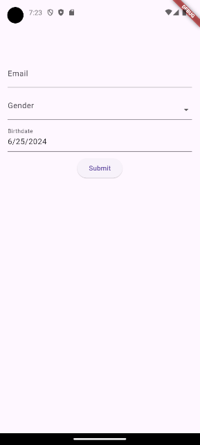
If we fill in the form and press submit we will get the following output:
[
  MapEntry(email: info@onlyflutter.com),
  MapEntry(gender: Male),
  MapEntry(birthdate: 2024-06-26 20:41:06.217114)
]
To retrieve the value of a single field, you can use the field name within square brackets as notation:
ElevatedButton(
  onPressed: () {
    if (_formKey.currentState!.saveAndValidate()) {
      print(_formKey.currentState!.value['email']);
    }
  },
  child: const Text('Submit'),
),
This will result in the following:
info@onlyflutter.comValidation
Data validation is important when creating forms because it ensures that users provide the right Data validation is important when creating forms because it ensures that users provide the correct information. The Form Builder Validators package helps us set up validation rules. For example, we can ensure certain fields are filled, check that email addresses are in the correct format, and set limits on numbers.
import 'package:flutter/material.dart';
import 'package:flutter_form_builder/flutter_form_builder.dart';
import 'package:form_builder_validators/form_builder_validators.dart';

void main() => runApp(MyApp());

class MyApp extends StatelessWidget {
  MyApp({super.key});

  final GlobalKey<FormBuilderState> _formKey = GlobalKey<FormBuilderState>();

  @override
  Widget build(BuildContext context) {
    return MaterialApp(
      home: Scaffold(
        appBar: AppBar(),
        body: Padding(
          padding: const EdgeInsets.all(16.0),
          child: FormBuilder(
            key: _formKey,
            child: Column(
              children: [
                FormBuilderTextField(
                  name: 'email',
                  decoration: const InputDecoration(labelText: 'Email'),
                  validator: FormBuilderValidators.compose([
                    FormBuilderValidators.required(),
                    FormBuilderValidators.email(),
                  ]),
                ),
                const SizedBox(height: 10),
                FormBuilderDropdown(
                  name: 'gender',
                  decoration: const InputDecoration(labelText: 'Gender'),
                  items: ['Male', 'Female', 'Other']
                      .map(
                        (gender) => DropdownMenuItem(
                          value: gender,
                          child: Text(gender),
                        ),
                      )
                      .toList(),
                  validator: FormBuilderValidators.compose([
                    FormBuilderValidators.required(),
                  ]),
                ),
                const SizedBox(height: 10),
                FormBuilderDateTimePicker(
                  name: 'birthdate',
                  decoration: const InputDecoration(labelText: 'Birthdate'),
                  inputType: InputType.date,
                  initialDate: DateTime.now(),
                  initialValue: DateTime.now(),
                  firstDate: DateTime(1900),
                  lastDate: DateTime.now(),
                  validator: FormBuilderValidators.compose([
                    FormBuilderValidators.required(),
                  ]),
                ),
                const SizedBox(height: 10),
                ElevatedButton(
                  onPressed: () {
                    if (_formKey.currentState!.saveAndValidate()) {
                      print(_formKey.currentState!.value.entries.toList());
                    }
                  },
                  child: const Text('Submit'),
                ),
              ],
            ),
          ),
        ),
      ),
    );
  }
}
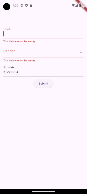
In this code snippet, we added the validator property and used the FormBuilderValidators.compose function to set validations. The function takes a list of FormBuilderValidators:
FormBuilderValidators.required: The field cannot be left empty.FormBuilderValidators.email: The entered text should be in a valid email format.
When the form is submitted, the FormBuilder widget automatically validates all the fields according to their validation rules. If the validation passes, the entered input is considered valid and can be accessed using _formKey.currentState!.value.entries.toList(). Otherwise, the user will see error messages displayed in the below screenshot.
Available fields
The Flutter Form Builder package provides a variety of pre-built form fields designed for different types of data and user interactions. These include checkboxes, dropdowns, date pickers, sliders, and more. These fields are highly flexible and can be customized to meet the specific needs of your application. Below is a list of all available fields along with an example:
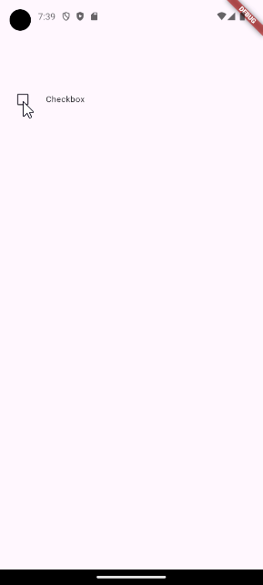
1. FormBuilderCheckbox
Represents a single checkbox field.
FormBuilderCheckbox(
  name: 'checkbox_field',
  title: const Text('Checkbox'),
  initialValue: false,
  onChanged: (bool? value) {},
),
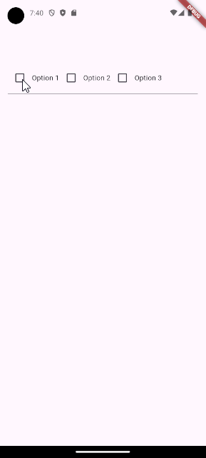
2. FormBuilderCheckboxGroup
Represents a list of checkboxes for multiple selections.
FormBuilderCheckboxGroup(
  name: 'checkbox_group_field',
  options: const [
    FormBuilderFieldOption(value: 'Option 1'),
    FormBuilderFieldOption(value: 'Option 2'),
    FormBuilderFieldOption(value: 'Option 3'),
  ],
  onChanged: (List<String>? values) {},
),
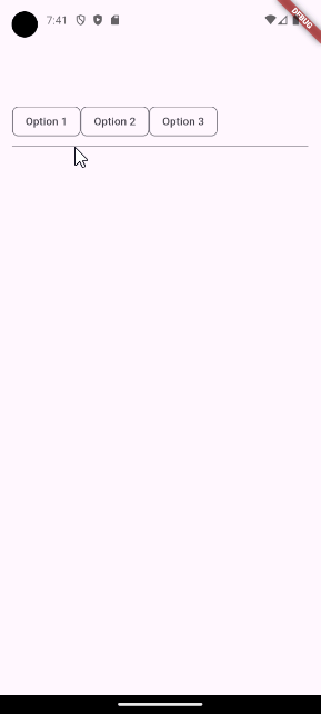
3. FormBuilderChoiceChip
Creates a chip that acts like a radio button for selecting one choice from a list.
FormBuilderChoiceChip(
  name: 'choice_chip_field',
  options: const [
    FormBuilderChipOption(value: 'Option 1'),
    FormBuilderChipOption(value: 'Option 2'),
    FormBuilderChipOption(value: 'Option 3'),
  ],
  onChanged: (String? value) {},
),
4. FormBuilderDateRangePicker
Allows users to select a range of dates.
FormBuilderDateRangePicker(
  name: 'date_range_field',
  decoration: const InputDecoration(label: Text('Date')),
  onChanged: (DateTimeRange? value) {},
  firstDate: DateTime.parse('2021-01-01'),
  lastDate: DateTime.parse('2024-06-25'),
),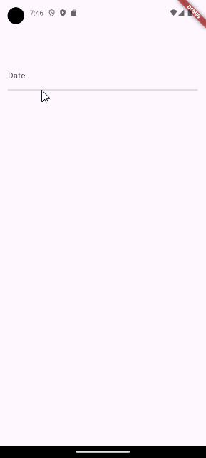
5. FormBuilderDateTimePicker
Allows users to input Date, Time, or DateTime values.
FormBuilderDateTimePicker(
  name: 'date_time_field',
  inputType: InputType.date,
  initialDate: DateTime.now(),
  initialValue: DateTime.now(),
  firstDate: DateTime(1900),
  lastDate: DateTime.now(),
  onChanged: (DateTime? value) {},
),
6. FormBuilderDropdown
Presents a dropdown list for selecting a single value from a list.
FormBuilderDropdown(
  name: 'dropdown_field',
  items: ['Option 1', 'Option 2', 'Option 3']
      .map(
        (String option) => DropdownMenuItem(
          value: option,
          child: Text(option),
        ),
      )
      .toList(),
  onChanged: (String? value) {},
),
7. FormBuilderFilterChip
Creates a chip that acts as a checkbox for filtering purposes.
FormBuilderFilterChip(
  name: 'filter_chip_field',
  options: const [
    FormBuilderChipOption(value: 'Option 1'),
    FormBuilderChipOption(value: 'Option 2'),
    FormBuilderChipOption(value: 'Option 3'),
  ],
  onChanged: (List<String>? values) {},
),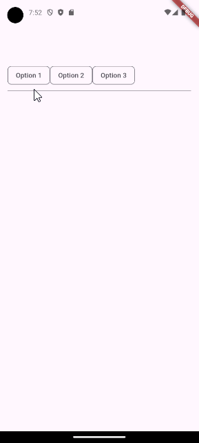
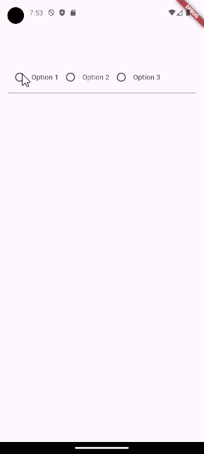
8. FormBuilderRadioGroup
Allows users to select one value from a list of Radio Widgets.
FormBuilderRadioGroup(
  name: 'radio_group_field',
  options: const [
    FormBuilderFieldOption(value: 'Option 1'),
    FormBuilderFieldOption(value: 'Option 2'),
    FormBuilderFieldOption(value: 'Option 3'),
  ],
  onChanged: (String? value) {},
),
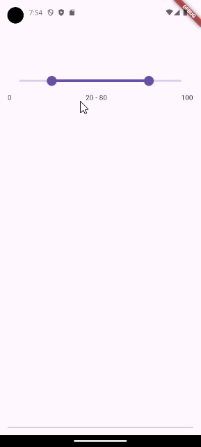
9. FormBuilderRangeSlider
Allows users to select a range from a range of values using a slider.
FormBuilderRangeSlider(
  name: 'range_slider_field',
  min: 0,
  max: 100,
  initialValue: const RangeValues(20, 80),
  onChanged: (RangeValues? values) {},
),
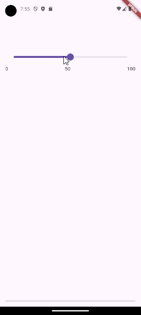
10. FormBuilderSlider
Represents a slider for selecting a double value.
FormBuilderSlider(
  name: 'slider_field',
  min: 0,
  max: 100,
  initialValue: 50,
  onChanged: (double? value) {},
),
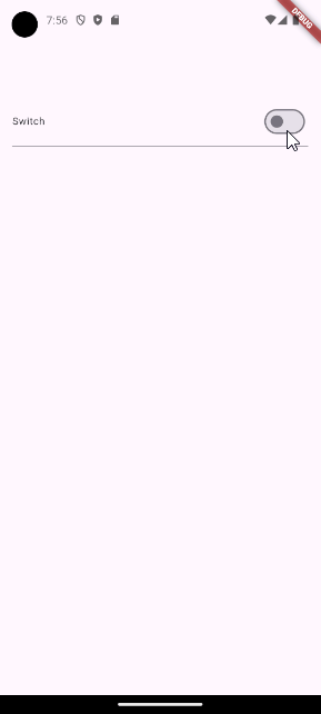
11. FormBuilderSwitch
Provides a switch field.
FormBuilderSwitch(
  name: 'switch_field',
  initialValue: false,
  title: const Text('Switch'),
  onChanged: (bool? value) {},
),
12. FormBuilderTextField
Represents a regular text input field.
FormBuilderTextField(
  name: 'text_field',
  decoration: const InputDecoration(labelText: 'Text'),
  onChanged: (String? value) {},
),
Conclusion
The Flutter Form Builder package makes it very easy to create complex forms. This is because the package already comes with a lot of built-in fields and simplifies the validation. Not only that, it also removes much of the boilerplate that is normally needed when you use the regular form widget.