In Flutter there are many ways to add shadows to your widgets. In this post, we will go over common methods to add shadows to the widgets inside your application. We will also take a closer look at the properties that control how shadows appear so you can create the perfect shadow effect.
Table of contents
Add Shadows to a Container
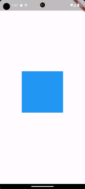
We will start by adding a shadow to one of the most commonly used widgets in Flutter: the Container widget. First, we set up a simple application inside our main.dart file that displays a centered Container widget with a blue background color.
import 'package:flutter/material.dart';
void main() => runApp(const MyApp());
class MyApp extends StatelessWidget {
const MyApp({super.key});
@override
Widget build(BuildContext context) {
return MaterialApp(
home: Scaffold(
body: Center(
child: Container(
width: 200,
height: 200,
color: Colors.blue,
child: const SizedBox.shrink(),
),
),
),
);
}
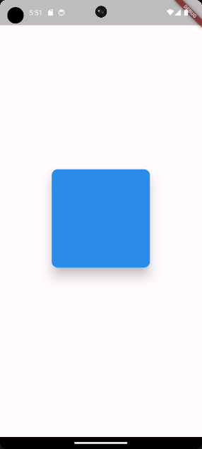
}When we run the main.dart file, you will see a blue Container displayed in the center of the screen.
Now let us proceed to the next section where we will apply shadows to the Container widget.
Use the BoxDecoration Class to Add Shadows to Widgets in Flutter
Adding shadows to a Container widget in Flutter can be done by using the BoxDecoration class. This class allows you to customize the Container widget’s appearance, including shadows.
import 'package:flutter/material.dart';
void main() => runApp(const MyApp());
class MyApp extends StatelessWidget {
const MyApp({super.key});
@override
Widget build(BuildContext context) {
return MaterialApp(
home: Scaffold(
body: Center(
child: Container(
width: 200,
height: 200,
decoration: const BoxDecoration(
color: Colors.white,
boxShadow: [
BoxShadow(
blurRadius: 25,
blurStyle: BlurStyle.normal,
color: Colors.black,
offset: Offset.zero,
spreadRadius: 2,
),
],
),
),
),
),
);
}
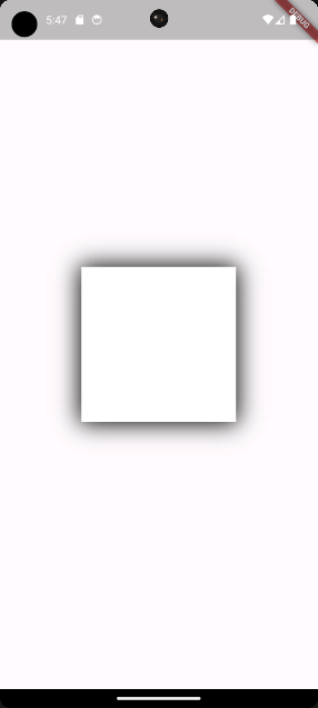
}In the above code, we replaced the color property of the Container with the decoration property. Within the decoration property, we use a BoxDecoration instance. The BoxDecoration instance allows us to set the background color and add a shadow effect to the Container.
Inside the BoxDecoration instance we set the colors property to Colors.white, and the boxShadow property to a list containing a single BoxShadow instance to add a shadow. The BoxShadow instance takes the following properties:
blurRadius:Determines the blurriness of the shadow. A higher value creates a softer shadow.blurStyle:Sets the style of the blur applied to the shadow. In this case, it is set to a regular blur.color:Sets the color of the shadow to the defined color, which in this example is set to black.offset:Specifies the shadow’s position. Here,Offset.zeromeans the shadow is directly underneath theContainerwith no offset in any direction.spreadRadius:Controls how far the shadow spreads from the edges of theContainer.
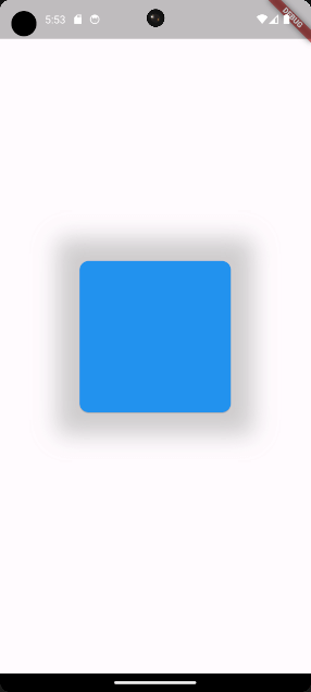
When we run the application, you will see a white Container with a dark shadow around it.
In the upcoming section of this post, we will take a closer look at each property of the BoxShadow class.
Exploring the BoxShadow class
So far we have learned that the BoxShadow class allows us to create shadow effects for Container widgets. The BoxShadow class offers a lot of customization. Let us go over the customization options to see what we can achieve with them.
1. blurRadius
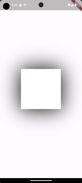
The blurRadius property controls how blurry the shadow will be. A larger value, such as 100, creates a softer and more noticeable shadow. On the contrary, setting the blurRadius to 0 results in a sharp-edged shadow.
BoxShadow(
  blurRadius: 100,
  blurStyle: BlurStyle.normal,
  color: Colors.black,
  offset: Offset.zero,
  spreadRadius: 2,
),
In this example, we set the blurRadius to 100 to make the shadow very soft and more spread out.
2. blurStyle
The blurStyle property in the BoxShadow class defines the style of blur applied to the shadow.
BoxShadow(
  blurRadius: 100,
  blurStyle: BlurStyle.solid,
  color: Colors.black,
  offset: Offset.zero,
  spreadRadius: 2,
),
In the above code, we use BlurStyle.solid, which creates a solid and sharp-edged shadow.

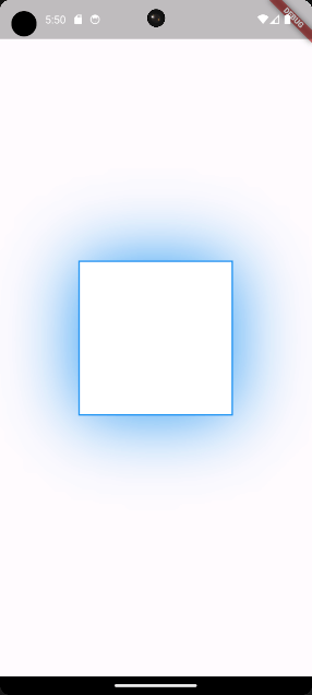
3. color
The color property in the BoxShadow class allows us to specify the color of the shadow.
BoxShadow(
  blurRadius: 100,
  blurStyle: BlurStyle.solid,
  color: Colors.blue,
  offset: Offset.zero,
  spreadRadius: 2,
),
In this code, we changed the color to Colors.blue, which will turn the shadow blue. You can use any color you desire, or even gradients for more creative effects.
4. offset
The offset property in the BoxShadow class determines the shadow’s position relative to the widget.
BoxShadow(
blurRadius: 100,
blurStyle: BlurStyle.solid,
color: Colors.blue,
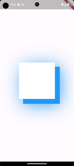
offset: Offset(25, 25),
spreadRadius: 2,
),In this case, we set the offset to Offset(25, 25), this will move the shadow 25 pixels to the right and 25 pixels below the widget. This creates a shadow effect that gives the impression of light coming from the top-left direction.
We can also use negative values to move the shadow in the opposite direction.
BoxShadow(
blurRadius: 100,
blurStyle: BlurStyle.solid,
color: Colors.blue,
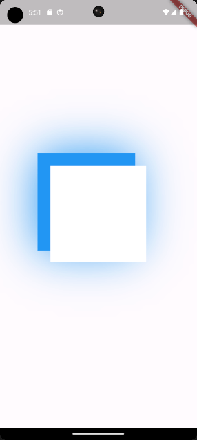
offset: Offset(-25, -25),
spreadRadius: 2,
),Right now, we have changed the offset to Offset(-25, -25), this will move the shadow 25 pixels to the left and 25 pixels above the widget. This change gives the impression of light coming from the bottom-right direction.
5. spreadRadius
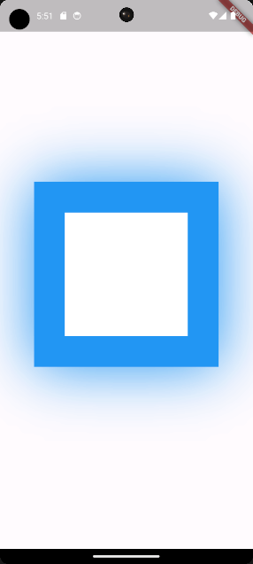
The spreadRadius property in the BoxShadow class determines how far the shadow spreads from the widget’s boundary.
BoxShadow(
  blurRadius: 100,
  blurStyle: BlurStyle.solid,
  color: Colors.blue,
  offset: Offset.zero,
  spreadRadius: 50,
),
In this example, we set the spreadRadius to 50, which means the shadow will extend 50 pixels from the edges of the widget.
Use Multiple BoxShadow Widgets to Add Shadows in Flutter
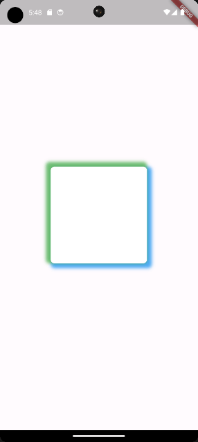
You might have noticed that the boxShadow property of the BoxDecoration class takes a list of BoxShadow instances. This means that you can apply multiple shadows.
Container(
  width: 200,
  height: 200,
  decoration: BoxDecoration(
    color: Colors.white,
    borderRadius: BorderRadius.circular(8),
    boxShadow: [
      BoxShadow(
        blurRadius: 5,
        color: Colors.blue.withOpacity(0.8),
        offset: const Offset(5, 5),
        spreadRadius: 5,
      ),
      BoxShadow(
        blurRadius: 5,
        color: Colors.green.withOpacity(0.8),
        offset: const Offset(-5, -5),
        spreadRadius: 5,
      ),
    ],
  ),
),
In this code snippet, we added two BoxShadow instances within the boxShadow property. Each instance has a different color, and one has a positive offset while the other has a negative offset. This creates a shadow around the Container widget with multiple colors.
Add Shadows on Other Widgets
As of now we have been creating shadows using the Container widget in combination with the BoxDecoration class. Some widgets also have shadows by default and can easily be modified using properties. Take the Card widget for example.
import 'package:flutter/material.dart';

void main() => runApp(const MyApp());

class MyApp extends StatelessWidget {
  const MyApp({super.key});

  @override
  Widget build(BuildContext context) {
    return const MaterialApp(
      home: Scaffold(
        body: Center(
          child: Card(
            color: Colors.blue,
            elevation: 20,
            shadowColor: Colors.black,
            child: SizedBox(
              width: 200,
              height: 200,
            ),
          ),
        ),
      ),
    );
  }
}
In this code, we use the Card widget with a blue background. We set the elevation to 20 to make the shadow stand out more, and the shadowColor to Colors.black for a dark shadow.
As you can see changing the shadow on the Card widget is simple! However, the BoxShadow method has more flexibility. Luckily in most cases, you can wrap your widgets with a Container widget, more about this in the next section.
Wrapping Widgets With a Container to Add Shadows in Flutter
In cases where the predefined shadows are not enough, you can wrap the widget with a Container widget and apply a custom BoxDecoration, as discussed earlier.
import 'package:flutter/material.dart';

void main() => runApp(const MyApp());

class MyApp extends StatelessWidget {
  const MyApp({super.key});

  @override
  Widget build(BuildContext context) {
    return MaterialApp(
      home: Scaffold(
        body: Center(
          child: Container(
            decoration: BoxDecoration(
              boxShadow: [
                BoxShadow(
                  blurRadius: 25,
                  blurStyle: BlurStyle.normal,
                  color: Colors.grey.withOpacity(0.5),
                  offset: Offset.zero,
                  spreadRadius: 25,
                ),
              ],
            ),
            child: const Card(
              color: Colors.blue,
              child: SizedBox(
                width: 200,
                height: 200,
              ),
            ),
          ),
        ),
      ),
    );
  }
}
In this code snippet, we wrapped the Card widget with a Container widget. By doing so, we can apply a custom shadow effect on the card using the BoxShadow class. Here, we created a shadow with a blurRadius of 25, a blurStyle of BlurStyle.normal, a color of grey with an opacity of 0.5, an offset of Offset.zero and a spreadRadius of 25.
We also removed the elevation and shadowColor properties from the Card widget to ensure that the custom shadow and the default card shadow do not interfere with each other.
Conclusion
When it comes to Flutter the are many ways to add shadows to your widgets. You can always use the Container widget in combination with the BoxDecoration class. Some widgets also have predefined shadows that can be altered by using properties.
Sometimes using the predefined shadows might not be enough, luckily you can often wrap those widgets with the container class for more flexibility.